Theo Economou, University of Exeter
David Stephenson, University of Exeter
Ken Mylne, Met Office
Rob Neal, Met Office
Weather forecasts and warnings are only useful if people use them to make decisions which help to protect lives, livelihoods and property. As forecasts become more sophisticated and include information on probability and risk they are potentially more valuable, but interpretation needs to be tailored to the vulnerabilities of particular decision-makers. This project has significantly advanced our capability to apply this in the field of severe weather warnings and opens the possibility of warnings tailored to the needs of individual users. Ken Mylne, Met Office
DOWNLOAD
THE CHALLENGE
Warning systems play a major role in reducing economic, structural and human losses from natural hazards such as windstorms and floods.
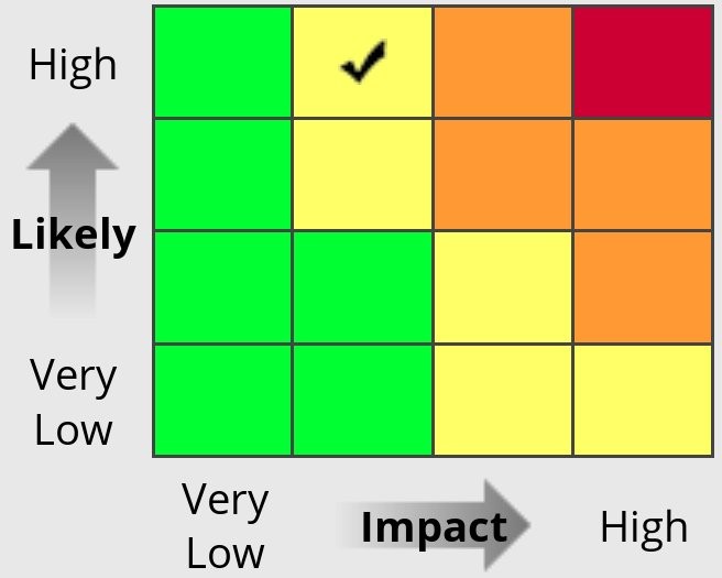
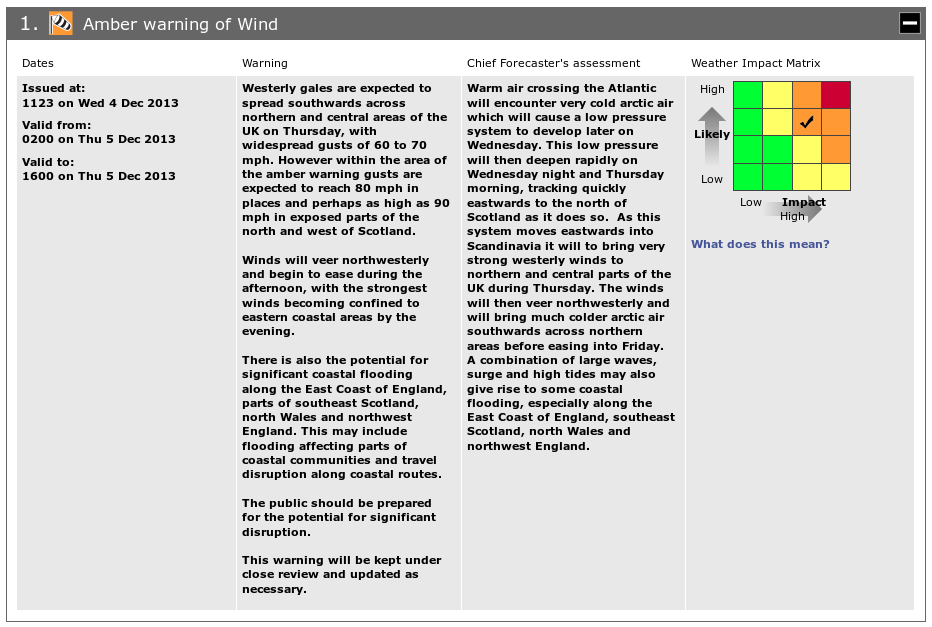
A weather warning system is a tool by which imperfect forecasts about the future are combined with potential consequences to produce a warning in a way that is deemed optimal. A warning system is only useful if well defined and thus understood by stakeholders. The challenge here was to improve the current severe weather warning system used by the UK Met Office, which uses traffic-light colours based on a likelihood-impact matrix illustrated below, by making it more transparent and tailored for the various end-users.
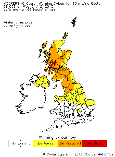
Weather impact matrix used in the National Severe Weather Warning Service, and a sample of automatically-generated warning colours using ensemble weather forecast data to help guide forecasters in the issue of warnings
WHAT WAS ACHIEVED
Based on sound mathematical theory, we produced a tool that combines predictions of future weather with user-attitude towards false alarms/missed events to produce bespoke warnings that are optimal for each user.
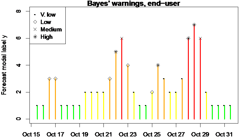
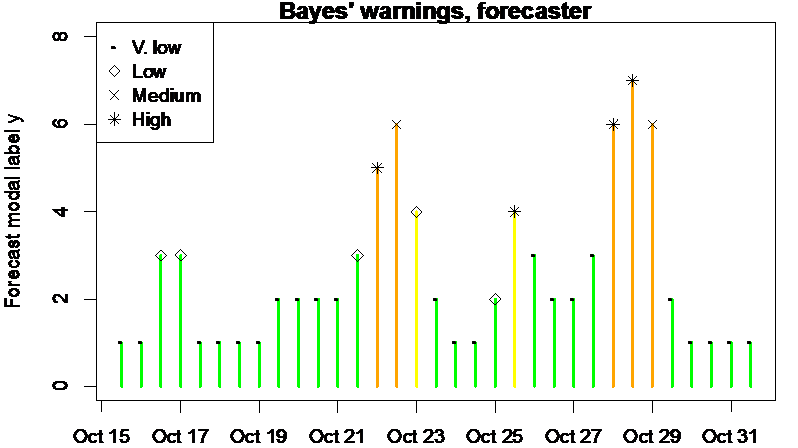
Below are examples of rainfall warnings during 15-31 October 2013 for two such users: 1) an end-user who is tolerant towards false alarms (left), and 2) a forecaster who issues warnings and thus less happy about false alarms as they might affect their credibility (right). There are 4 increasing levels of warnings: green, yellow, amber and red, and 4 rainfall intensity categories: very low, low, medium and high. The height of the bars indicates the forecasted rainfall intensity (1 for no rainfall, 8 for high rainfall) whereas the symbols at top of each bar indicate what actually happened. Clearly the end-user and the forecaster have very different views about what warnings they want to see, which is what our framework is designed for: bespoke warnings to all end-users, with minimal user input regarding false-alarm appetite.
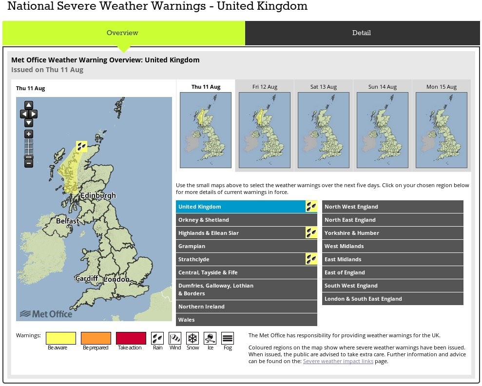
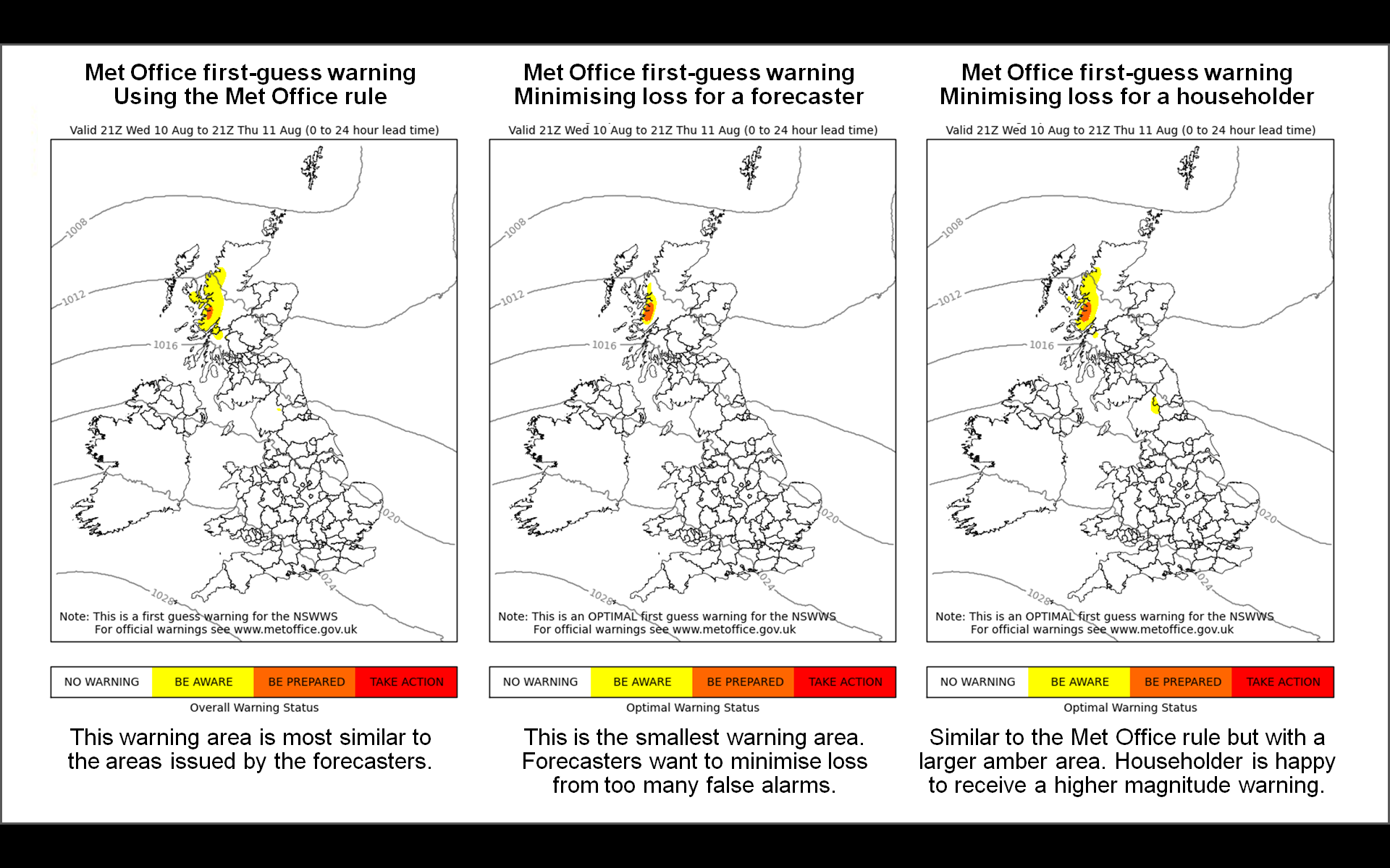
The method developed is being implemented as a trial demonstrator at the Met Office using live forecast data. Below is an example of a heavy rainfall warning issued on 11 Aug 2016, together with three automated first-guess warnings based on different loss functions as described above.